Crafting the Invisible Narrative: A Cinematographer's Approach to Visual Storytelling

Crafting the Invisible Narrative: A Cinematographer's Approach to Visual Storytelling
Executive Summary
Visual storytelling is the bedrock of compelling cinema, extending far beyond pretty pictures to become the very architecture of emotion and narrative. This guide is written for working cinematographers seeking to deepen their craft, aspiring D.P.s building their visual vocabulary, and filmmakers who want to understand how the camera can become their most eloquent collaborator. For professional filmmakers, this means a rigorous command over the entire visual lexicon: cinematography, mise-en-scène, and post-production, particularly color. It's about wielding light, shadow, composition, movement, and the subtle language of spectral response to sculpt meaning that dialogue alone cannot achieve. This guide delves into the practical and philosophical dimensions of visual storytelling, moving from foundational principles of scene construction to the nuanced art of color grading as a narrative intensifier. We'll explore how precise choices in every visual element, from lens choice to the final grade, contribute to a unified, visceral, and unforgettable audience experience, providing the tools to transcend mere representation and imbue every frame with purpose.
Table of Contents
- The Genesis of Visual Language
The Genesis of Visual Language
At its core, visual storytelling is about communicating without words, or rather, using words as just one layer in a richer, deeper emotional tapestry. It's the silent film director's art, updated for the complexities of modern production. Forget the common misconception that it's simply about making things look good. That's a shallow interpretation. Visual storytelling, for serious practitioners, is the intentional deployment of every pictorial element to convey narrative, character intention, mood, and thematic resonance. It's the foundation upon which all other layers of meaning are built.
Think about the Impressionists. They weren't striving for photographic realism. They were after the impression of light, air, and feeling. They understood that the reflection, the ephemeral quality of how light behaves, can reveal more than a direct, objective rendering of reality. This is our aim as filmmakers. We're not just showing a scene; we're giving the audience a feeling about that scene, an intuition about its underlying dynamics. The visual reflection reveals more than the surface.
This approach applies across diverse fields, from cinematic dramas to explainer videos and UX design. StudioBinder, for instance, articulates how camera placement, composition, and lighting are the visual methods filmmakers use to shape how a film "looks and feels" to serve narrative clarity, not just spectacle. Similarly, the Interaction Design Foundation details how visual hierarchy in UX design guides user attention and understanding, preventing confusion and frustration. The principle is consistent: visuals are not merely decorative; they are functional, guiding the viewer's emotional journey and cognitive processing.
For us, however, the stakes are higher. We're not just guiding clicks; we're guiding hearts and minds. We're asking an audience to invest in a world, to believe in characters, and to feel the weight of their journeys. That requires a depth of visual craft that touches on the subconscious. When I'm looking at a frame, I'm not just seeing if the exposure is right; I'm asking: what is this image feeling like? What emotion is it trying to evoke, and is it succeeding? This phenomenological approach, asking what does it feel like to watch, is crucial.
Our craft is about purposeful visuals. Every choice, from the focal length of a lens to the saturation of a color, must be an active participant in the story. It's about moving beyond simply recording action to actively interpreting and shaping it for the audience. This is where the intellectual rigor of a film historian meets the intuitive instincts of a working artist. We understand the historical precedents of visual language, and we apply them with contemporary sensibility.
Cinematography as the Primary Storyteller
Cinematography isn't just about capturing images; it's about authoring them. It's the language of the moving picture, spoken through light, shadow, form, motion, and color. When I approach a project, I always think of the cinematography as the film's silent narrator. What is it saying when no one is speaking? What underlying truths or unspoken emotions is it revealing?
Professional film resources, like those from StudioBinder, rightly emphasize that visual storytelling hinges on mastering core cinematography techniques: camera placement, shot composition, shot size, focus, lighting, and camera movement. These aren't isolated tools; they're a symphony. Each plays a distinct role in conveying information and emotion without a single line of dialogue.
Consider the classic example of shot size. A wide shot establishes context, a full shot shows the character in their environment, a medium shot invites some emotional connection, and a close-up isolates emotion, forcing intimacy or revealing critical detail. It's a progression, a visual zoom into the character's psyche or the narrative's core. Each choice has an immediate, visceral impact on the audience's perspective and emotional proximity to the subject. You're not just moving a camera; you're modulating empathy.
Then there's the nuance of focus. Rack focus isn't merely a technical shift; it's a redirection of audience attention and, often, a reveal of deeper meaning. Pulling focus from one character to another in a tense dialogue scene can shift power, reveal a reaction, or underscore an unspoken thought. It's an editorial decision made in-camera, in real-time, dictating where the audience must look and, by extension, what they must feel is important.
A critical aspect here is understanding that technique should never overshadow narrative. The most effective cinematography is often invisible, integrated so seamlessly that the audience experiences the story directly, rather than admiring the craft. Overly showy visuals, as industry professionals often note, draw attention to themselves and away from the story. This is a fundamental distinction between a D.P. who understands visual storytelling and one who is merely technically proficient. Our goal is to serve the story, always.
The Psychology of Composition and Framing
Composition and framing are not just aesthetic choices; they are psychological maneuvers. They dictate where the audience's eye goes, what significance to attribute to elements within the frame, and even how to feel about the characters. It's about building a visual hierarchy so compelling that the viewer subconsciously follows your predetermined path of meaning.
The rule of thirds is a starting point, not an end. True mastery goes beyond dividing the frame into nine squares. It's about understanding negative space, balance, symmetry, and asymmetry. A character placed off-center in a vast, empty frame can evoke loneliness or insignificance. Conversely, filling the frame with a character can suggest power, claustrophobia, or intense focus. These aren't arbitrary decisions; they are psychological levers.
Consider eye-line and gaze. Where a character looks within the frame, and where the camera places the audience in relation to that gaze, profoundly impacts identification and emotion. If a character looks directly into the lens, it can break the fourth wall, inviting the audience directly into their emotional space or challenging them. If they look off-screen, it suggests a bigger world, an unseen threat, or a longing. The audience naturally wonders, what are they looking at? This creates intellectual and emotional engagement.
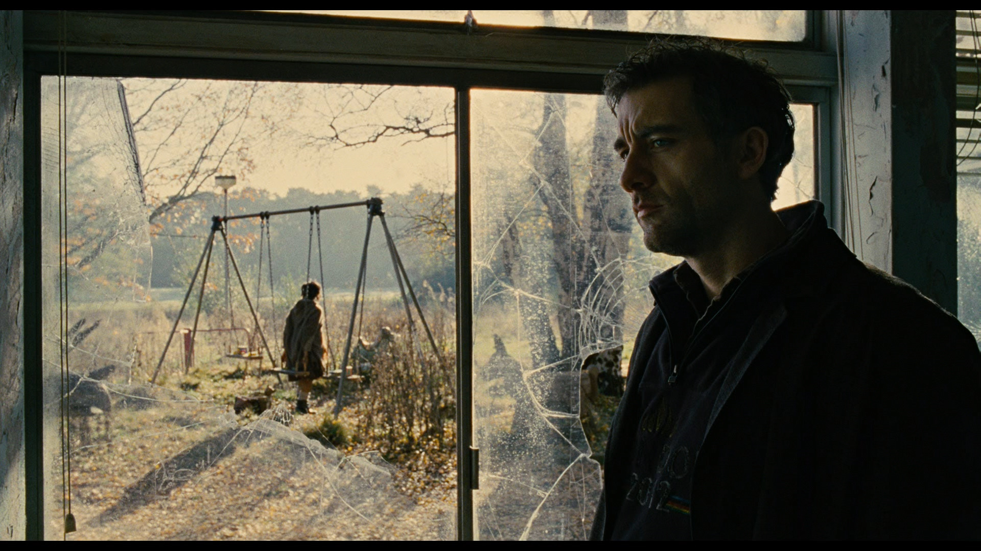
Framing also implicitly defines boundaries and connections. A character framed by a doorway or window might feel trapped or isolated, peering into another world. Two characters framed tightly together suggest intimacy or conflict. The edges of your frame are as important as the center. What you exclude is often as powerful as what you include. This is a lesson in effective communication: precision and economy of visual information.
In my own work, I often think about the "breathing room" of a frame. Too tight, and the audience feels confined. Too loose, and the character might feel lost. It's a delicate balance, and it changes with every scene, every emotional beat. This isn't just about academic rules; it's about the innate human response to spatial relationships and visual weight. We are manipulating perceived reality, influencing the very experience of the story. Like a well-composed painting, the elements within our frame must resonate, creating an internal rhythm and harmony that serves the narrative.
Pro Tip: Challenge yourself to tell a simple, emotional story using only still frames and composition. No dialogue, no movement. What emotions can you evoke just by the arrangement of elements within the frame? This exercise sharpens your compositional instincts.
Lighting: Sculpting Emotion and Information
Light is not just illumination; it is emotion, information, and a character in itself. As cinematographers, we don't just "light a set"; we sculpt with light, revealing and concealing, shaping mood and guiding the audience's emotional response. The choice of soft or hard light, high key or low key, practical or motivated sources: each decision has a profound, almost primal, impact.
Hard light, with its sharp shadows and defined lines, can communicate harshness, drama, or psychological tension. Think film noir: the stark contrasts and deep shadows aren't just stylistic; they embody moral ambiguity and an unforgiving world. Soft light, by contrast, suggests warmth, intimacy, or gentleness. It often flatters, creating a more ethereal or romantic feel. Understanding these inherent psychological qualities of light is fundamental.
The direction of light is equally critical. Front light can flatten, making subjects appear less dimensional, sometimes used for documentary honesty or a sense of direct address. Backlight creates separation, haloing, and often a sense of mystery or transcendence. Side light emphasizes texture and form, carving out a face with dramatic shadow, revealing character intricacies. Overhead light can be stark, judgmental, or isolating, while under-lighting is often used for horror or a sense of unease.
Then there's motivated versus unmotivated light. While we sometimes use unmotivated light for aesthetic effect (and the audience accepts it), motivated light, meaning light that visibly comes from a source within the scene, like a window, lamp, or street light, grounds the scene in reality and enhances immersion. The mastery lies in seamlessly blending the two, using the practical sources to justify the cinematic ones.
In my experience, color temperature is another powerful, often overlooked, tool. A warm orange glow from a practical lamp suggests comfort or a nostalgic past. A cool blue from moonlight or a high-rise city office evokes isolation or modernity. These aren't just white balance adjustments; they're emotional color palettes that establish context and feeling. For a deeper exploration of how light shapes visual identity, see our guide on The Architect of Light: Building a Cohesive Visual Language for Your Film.
Remember, light fundamentally controls contrast, and contrast controls attention. By manipulating areas of brightness and darkness, we direct the viewer's eye. A bright spot in an otherwise dark frame inevitably draws focus. This isn't just about exposure; it's about making deliberate decisions to highlight and obscure, guiding the narrative with invisible strokes of light.
Common Mistake: Relying solely on general ambient light or flat fill. This robs your image of dimension, mood, and narrative power. Every light source should have a purpose.
Movement: Guiding the Gaze and Pacing the Narrative
Camera movement is the dynamic heartbeat of visual storytelling, transforming a static image into an immersive experience. It's not just about tracking a subject; it's about controlling pacing, revealing information, and articulating emotional states. The way the camera moves, or chooses not to move, is a profound narrative choice.
Consider the difference between a steady, measured dolly shot and a frenetic, handheld chase. The dolly imparts a sense of calm, inevitability, or observation, drawing the audience into the scene with deliberate grace. The handheld shot, with its inherent instability, conveys urgency, chaos, or a character's subjective experience. These aren't just techniques; they're emotional signatures.
Pan and tilt movements guide the audience's gaze, revealing elements sequentially and controlling the flow of information. A slow pan across a landscape can establish a sense of place or the passage of time. A quick tilt up to a looming structure can imply power or threat. These movements are akin to a narrator's voice, highlighting specific details at specific moments.
Cranes and jibs offer unique perspectives, lifting the camera above the action, often for metaphorical effect. A soaring crane shot can emphasize isolation, destiny, or the smallness of humanity against a vast backdrop. It suggests a god's-eye view, or at least a detached perspective.
Then there's the power of lack of movement. A completely static shot can create tension, force the audience to observe minutiae, or emphasize a sense of entrapment or helplessness. When a film moves extensively and then suddenly becomes still, that stillness itself becomes a dramatic event, demanding attention. It's a contrast that amplifies narrative.
In my work, I find that a carefully orchestrated camera movement can be more impactful than any line of dialogue. It reveals relationships, emotions, and narrative shifts in a way that words simply cannot. It's the visual equivalent of a musical score: it elevates, underscores, and propels the emotional journey. When planning camera movement, I ask: what is the narrative intent of this movement? Is it to follow, to observe, to reveal, or to actively participate in the emotion of the scene? Every inch the camera travels must serve the story.
Pro Tip: Before committing to a complex rig, try to achieve the same narrative goal with a simpler movement, or even a static shot. Sometimes, restraint in movement is the most profound choice.
The Subtlety of Lens Choice and Sensor Behavior
The lens is the eye of the camera, but it's more than just a conduit for light. It's an interpretive instrument, shaping perspective, depth, and even the emotional quality of the image. The choice between a wide-angle, normal, or telephoto lens is a fundamental decision in visual storytelling, each carrying its own psychological weight and narrative implications.
Wide-angle lenses exaggerate perspective, making near objects feel closer and far objects appear more distant. They tend to create a sense of expansiveness, context, or sometimes distortion and unease when used close to a subject. They pull the audience into the environment, emphasizing spatial relationships.
Normal lenses approximate human vision, offering a balanced perspective without obvious distortion. They ground the image in a sense of objective reality, making them often used for capturing naturalistic performances or scenes where the camera acts as an unobtrusive observer.
Telephoto lenses compress perspective, making foreground and background elements seem closer together. They isolate subjects, blurring backgrounds and focusing attention, often creating a sense of intimacy, surveillance, or detachment. They can flatten emotional distance, making characters feel more physically, but perhaps not emotionally, close.
Beyond focal length, the specific character of a lens is crucial. Modern, sharp, high-contrast lenses deliver clinical precision, often suitable for contemporary dramas or where a sense of clarity is paramount. But their perfection can sometimes feel sterile. Vintage lenses, with their softer contrast, gentler fall-off, and subtle aberrations (flares, bokeh imperfections), impart a unique texture and emotional resonance. They might introduce a dreamlike quality, a nostalgic haze, or a raw, unfiltered realism. This isn't about technical "perfection"; it's about aesthetic and emotional intent. What does this lens feel like?
Then there's sensor behavior. Modern digital sensors have incredible dynamic range and color science, but each brand and model has its own distinct way of rendering light, shadow, and color. I spend a lot of time understanding how different sensors handle highlights and shadows, how their color science interprets skin tones, and how they react to specific types of lighting. This knowledge allows me to anticipate how the image will behave in post-production and helps me select the right camera system to achieve a specific visual texture and emotional palette. It's about knowing your tools intimately, not just theoretically.
Pro Tip: Shoot tests with your preferred lenses and camera system under various lighting conditions, specifically observing how highlights roll off and shadows behave. This informs your pre-production and grading decisions.
Mise-en-Scène: Every Detail Matters
Mise-en-scène, quite literally "placing on stage," encompasses everything within the frame that isn't camera movement or editing. It's the art of conscious arrangement of objects, actors, costumes, props, and set design to create visual meaning. For the discerning filmmaker, every detail within the frame is an opportunity to tell the story, to build character, or to layer thematic significance.
Think of the coherence. Movie graphics, including set design, lighting (which we've covered), color grading, and CGI, aren't just decorative elements; they form a cohesive narrative experience that guides the viewer's emotions. This coherence is the hallmark of thoughtful mise-en-scène.
Beyond the obvious, consider the subtle power of props. A seemingly insignificant object on a character's desk, such as a specific book, a half-finished cup of coffee, or a faded photograph, can reveal layers of backstory, personality, or current mental state without a single word of dialogue. It's visual shorthand, rewarding the attentive viewer and enriching the world you've created.
Costume design is another potent tool. It instantly communicates social status, profession, personality traits, and even emotional arcs. A shift in costume can signify a character's internal transformation, a change in their circumstances, or a deliberate mask they choose to wear. The color, texture, and style of clothing are all part of this silent narrative.
Set design isn't just about creating a convincing backdrop; it's about creating a living, breathing environment that informs the narrative. A cluttered, chaotic room might reflect a character's inner turmoil. A sparse, minimalist space could suggest control, isolation, or emptiness. The architecture, the decor, the specific furniture choices: they all contribute to the psychological landscape of the film.
In my experience, strong mise-en-scène comes from meticulous attention during pre-production. It's a collaborative effort, a continuous dialogue between the director, production designer, costume designer, and myself. We discuss character backstories, thematic intentions, and emotional beats to ensure that everything placed within the frame serves a deliberate purpose. It's about building a world that feels lived-in, authentic, and riddled with subtext.
Common Mistake: Treating sets as mere backgrounds. Every element on screen is an opportunity to speak to the audience. If something isn't contributing, it's detracting.
The Art of Color as a Narrative Force
Color is arguably the most visceral of our tools, bypassing intellect and going straight for emotion. It's not just about making an image look "pretty" or "cinematic"; it's about harnessing the psychological impact of specific hues, saturations, and luminances to deepen narrative, define characters, and articulate thematic concerns. This is where my background as a colorist and my understanding of Impressionistic principles truly converge with cinematography.
Just like the Impressionists were interested in the subjective feeling of light, we use color to evoke a subjective emotional response. A vibrant, high-saturation palette can signify joy, energy, or a fantastical world. A desaturated, muted palette might suggest despair, austerity, or a stark realism. These aren't arbitrary stylistic choices; they are deliberate narrative decisions.
The perception of color is deeply ingrained in human psychology. Red often signifies passion, danger, or anger. Blue can evoke sadness, tranquility, or coldness. Green can be growth, envy, or illness. But it's rarely that simplistic. The context and combination of colors amplify or contradict these innate associations. A desaturated red might feel like old blood, while a vibrant red could be a defiant splash of life.
Color grading, for me, is the final layer of authorship in visual storytelling. It's where the raw sensor data is transformed into the desired emotional reality. It's not about correcting; it's about creating. It's about establishing a consistent color palette that supports the film's genre, tone, and character arcs. A character's emotional journey might be mirrored by a subtle shift in their associated color temperature or saturation across the film.
My approach to grading is phenomenological. I'm not just adjusting lift, gamma, and gain. I'm asking: what does this feel like? If this scene is about regret, how does regret look as a color? How does it look as a subtle shift in contrast? This is where the artistry lies. It's about intuition informed by deep technical knowledge.
We're often talking about creating an emotional score with color, an invisible layer of narrative that resonates with the audience on a subconscious level. It's the difference between intellectual cinema, which engages the mind, and pure cinema, which moves the soul. Color, when wielded masterfully, is a potent force in achieving the latter. It breathes life into the reflection.
Pro Tip: Analyze films you admire (e.g., Tarkovsky, Wong Kar-wai, Deakins) focusing only on the color palettes. How do they support the story and characters? Try to articulate the emotional language of their colors.
Case Studies: Visual Language in Practice
Theory transforms into craft only when applied to specific images. Let's examine how master cinematographers have deployed these principles in memorable work.
Roger Deakins and Denis Villeneuve: Motivated Light in Sicario
The border tunnel sequence in Sicario (2015) demonstrates Deakins' philosophy that every light source should be motivated and purposeful. As the tactical team descends into the drug cartel tunnel, Deakins relies almost entirely on the soldiers' helmet-mounted lights and infrared vision. There's no cheating with fill light to make the actors more visible. The result is claustrophobic and disorienting: faces emerge and disappear, the walls close in, and the audience shares the soldiers' vulnerability.
What makes this remarkable is Deakins' restraint. A lesser cinematographer might have added ambient light "for the audience" or pushed the exposure to reveal more detail. Deakins understood that the darkness itself is the story. The tactical lights create pools of visibility surrounded by threatening blackness, mirroring the moral ambiguity of the mission. When violence erupts, it happens in fragmentary glimpses, making it more visceral than any fully-lit action sequence. The light doesn't just illuminate; it restricts, controls, and terrifies.
This is motivated lighting taken to its logical extreme: if the only light sources in a tunnel are what the characters carry, that's what the audience sees. The commitment to that reality creates an authenticity that audiences feel even if they can't articulate why.
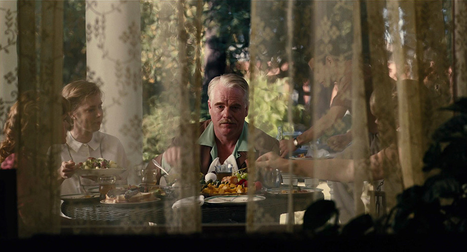
Christopher Doyle and Wong Kar-wai: Color as Emotional Isolation in In the Mood for Love
Wong Kar-wai's In the Mood for Love (2000), shot by Christopher Doyle and Mark Lee Ping-bin, uses color not as decoration but as the emotional temperature of repressed desire. The film's palette centers on deep reds, greens, and golds, colors that feel simultaneously lush and melancholic.
Consider the scenes in the narrow hallway of the apartment building where the two protagonists repeatedly pass each other. The walls are painted a saturated red that borders on crimson. Traditional Hollywood logic would suggest red equals passion, but here it feels more like suffocation. The color is everywhere, inescapable, just like the attraction the characters cannot act upon. It's passion that has nowhere to go.
The repetition matters. By returning to this same color palette across dozens of brief encounters, Wong and Doyle create a visual rhythm of longing. The consistency of the color tells us nothing has changed; the intensity tells us everything is building. When the film occasionally shifts to cooler tones for scenes in offices or public spaces, the absence of that warmth feels like exile.
Doyle frequently shoots through doorways, windows, and curtains, adding layers between the camera and the subjects. Combined with the color, this creates images that feel like memories being viewed through emotion rather than literal records of events. The color doesn't illustrate the story; it is the story.
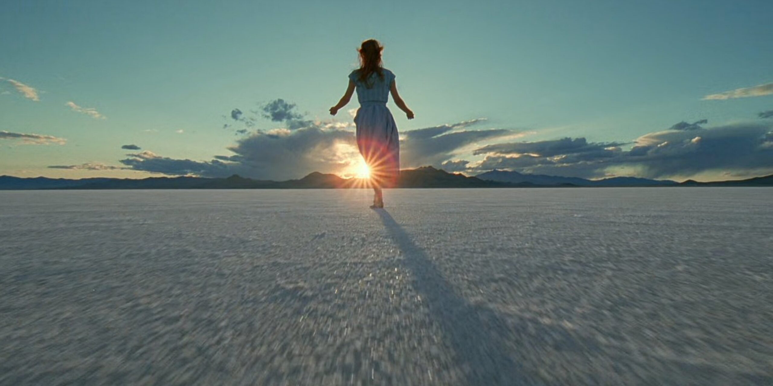
Emmanuel Lubezki and Terrence Malick: Natural Light as Spiritual Grammar in The Tree of Life
Emmanuel Lubezki's work on The Tree of Life (2011) represents a radical commitment to natural light that borders on the devotional. Lubezki and Malick made a creative decision to shoot almost exclusively during "magic hour," that brief window after sunrise and before sunset when light is soft, directional, and golden.
The practical implications were enormous: scenes had to be choreographed quickly, often shot in sequence regardless of script order, and the entire production bent around the sun's schedule. But the results justify the difficulty. Every frame has the quality of a half-remembered childhood moment, that specific amber warmth that memory seems to bathe our earliest experiences in.
What elevates this beyond mere prettiness is the consistency. By establishing natural light as the film's visual grammar, Lubezki creates a contrast when the film moves to the father's world of offices and industry, where artificial light intrudes. The harshness of those interiors feels like a fall from grace, a departure from the prelapsarian glow of the family home.
The light also serves Malick's philosophical concerns. The film asks questions about existence, meaning, and the relationship between the individual and the cosmos. By grounding these abstractions in the concrete reality of how actual sunlight falls through actual windows onto actual faces, Lubezki gives transcendence a texture. The divine isn't depicted through special effects but through the careful observation of how light already behaves in the world.
From Concept to Grade: A Workflow for Visual Integrity
Maintaining visual integrity from the initial concept through to the final color grade is paramount. It's a continuous dialogue, a constant negotiation, not a series of isolated steps. For professionals, this means a cohesive workflow where every creative and technical decision builds upon the last, all serving the overarching narrative purpose.
It begins in pre-production. During script breakdown, I'm not just thinking about shot lists; I'm envisioning the visual architecture of the entire film. What's the central visual metaphor? What are the key emotional beats, and how will light, color, and composition articulate them? This involves creating look books, mood boards, and detailed lighting diagrams with the director and production designer. We establish the desired aesthetic, the emotional palette, and the visual rules of the world.
Then, on set, the technical execution comes into play. We are meticulously crafting the image, but always with the end in mind. This means understanding how the camera's sensor will render color and dynamic range, how the chosen lenses will impart their character, and how every light source will contribute to the desired mood. Accurate white balance and exposure are foundational, but they're just the starting point for creative manipulation in post. Our goal on set is to capture the best possible raw image, rich in information, that allows maximum flexibility for the final grading pass.
The handoff to the DIT and then to the colorist (often myself) is critical. Establishing a proper color pipeline from camera to monitor to final output ensures consistency. This involves LUTS (Look Up Tables) that are built not just for monitoring on set, but as a creative guide for the final grade. These aren't just technical conversions; they're artistic intent translated into data.
In the grading suite, the initial vision is realized, refined, and often intensified. This is where the subtle nuances of color, contrast, and texture are finely tuned, echoing the mood boards and visual intentions established months prior. It's a process of finessing, sculpting, and sometimes finding new nuances that weren't initially obvious. The goal is always to enhance the storytelling, to make the audience feel the film rather than merely observe it. It's an iterative process, constantly checking against the narrative and emotional beats of the story.
Common Mistake: Neglecting visual planning in pre-production, leading to inconsistent looks and reactive decision-making in post. Visual storytelling starts with the script, not with the camera.
Avoiding the Pitfalls: Common Mistakes in Visual Storytelling
Even experienced filmmakers can fall into traps that undermine effective visual storytelling. Recognizing these common pitfalls is crucial for maintaining integrity and impact.
Pretty Pictures That Say Nothing
One of the most frequent errors is using "pretty pictures" for their own sake. Gorgeous shots that don't serve the narrative are distracting. They pull the audience out of the story, making them admire the technique rather than feel the emotion.
What this looks like: A sweeping drone shot over a mountain range at golden hour, cut into a dialogue-heavy domestic drama. The image is stunning, but what is it telling us about the characters arguing in their kitchen? Nothing. It's a postcard interrupting a conversation. Or consider a beautifully backlit silhouette of a character standing at a window, shot with impeccable rim lighting, in a scene that's supposed to be about an ordinary Tuesday morning. The image says "significance" while the narrative says "routine." The mismatch creates confusion.
The best cinematography, as often reiterated, disappears into the story. A beautiful image that doesn't advance the plot or reveal character is a failure, no matter how aesthetically pleasing it may be.
Inconsistent Visual Language
Switching between wildly different lighting styles, color palettes, or compositional approaches without clear narrative justification can create a jarring and confusing experience.
What this looks like: A film that opens with naturalistic, available-light photography in muted earth tones, then inexplicably shifts to high-contrast, neon-saturated imagery for a dinner scene with no corresponding story reason. Or a drama where the first act uses steady, composed wide shots, the second act introduces handheld close-ups, and the third goes back to the original style, all without any in-story evolution to justify the changes. The audience may not consciously notice these inconsistencies, but they feel them as a vague sense that something is "off" about the film.
The visual world you create needs internal consistency. Every visual shift should have an identifiable narrative or emotional trigger.
Ignoring Psychological Impact
Forgetting how specific technical choices read emotionally means you're not wielding your tools effectively.
What this looks like: Using a wide-angle lens inches from an actor's face for what's meant to be a tender romantic moment. The distortion makes their features bulge; their nose looks enormous; their eyes are pushed to the edges of their head. The audience feels unease when they should feel warmth. Or lighting a sympathetic character from below during their introduction, casting shadows that make them look sinister. You've told the audience not to trust this person before they've said a word, and when the character turns out to be the hero, the initial impression lingers as confusion.
Every visual choice has an inherent psychological effect. The audience should never have to work to understand what's visually important.
Color Grading as "Fixing"
Treating color grading as simply "fixing" the image rather than an act of creative authorship is a major missed opportunity.
What this looks like: A colorist who spends the entire session matching shots and neutralizing color casts, then declares the work complete. The film comes out looking "correct" but generic, indistinguishable from any other competently shot project. Or a workflow where the grade is an afterthought, something done in the final week before delivery with whoever is available, rather than a creative collaboration planned from pre-production.
Color grading is the moment to infuse the cinematic reflection with life, to deepen the felt experience. It's not just about correcting; it's about shaping.
Pro Tip: During feedback sessions, pay close attention to audience reactions. If a visual element is consistently praised for its beauty but doesn't contribute to their understanding or emotional connection to the story, it's likely a misstep.
Beyond Aesthetics: Ethical and Intellectual Dimensions
Visual storytelling, in its most profound sense, extends beyond mere aesthetics and technique; it carries significant ethical and intellectual weight. As creators, we hold immense power in shaping perception, influencing emotion, and, consciously or unconsciously, reinforcing narratives about the world. Given the claim that we're "shaping culture, one frame at a time," this section deserves serious attention.
The Ethics of Representation
How we frame characters, employ stereotypes, or portray certain communities matters. Visuals can manipulate and persuade, whether in a film or a marketing campaign. We have a responsibility to avoid deceptive visual exaggeration and to ensure our imagery is accurate and fair.
Consider how lighting choices affect the depiction of different skin tones. For decades, film stocks and lighting conventions were optimized for white skin, with the result that Black actors were often poorly lit, their features either lost in underexposure or flattened by overlighting. This wasn't just a technical limitation; it was a failure of attention, a system that literally couldn't see certain people properly. The work of cinematographers like Bradford Young on Selma and Arrival represents a conscious correction, developing lighting approaches that render dark skin with the same dimensionality and beauty that had always been afforded to lighter complexions. Young often uses practical sources and negative fill to create contrast on dark skin rather than flooding the face with flat fill light. The result is faces that feel sculpted, alive, and individual rather than generically lit.
This extends to framing and camera placement. Low-angle shots connote power; high-angle shots suggest vulnerability or diminishment. When these conventions are applied unreflectively, entire groups can be systematically diminished. Consider films where female characters are consistently shot in close-up emphasizing their faces while male characters receive full-body shots that emphasize their physicality and action. The visual grammar is telling the audience who is a subject and who is an object, who acts and who is looked at.
Casting, Framing, and Stereotype
The camera is not neutral; it inherits and can perpetuate the biases of its operators. The history of Hollywood includes countless examples of cinematography reinforcing racial and gender stereotypes: high-key lighting for the innocent blonde, shadows falling across the face of the "exotic" Other, wide-angle distortion for comic effect on bodies deemed laughable.
Contemporary cinematographers bear the responsibility of recognizing these patterns and making different choices. This doesn't mean abandoning visual language; it means using it with awareness. When Barry Jenkins and James Laxton shot Moonlight, they made the deliberate decision to light Black skin in ways that emphasized its beauty and variety, using techniques drawn from fashion photography and classical portraiture rather than the "urban grit" conventions that might have been the default for a film set in that milieu. The result was images that many Black viewers described as seeing themselves on screen, truly seeing themselves, for the first time.
Similarly, consider how the framing of bodies communicates value. The "male gaze" in cinema has been extensively theorized: the tendency to fragment women's bodies into parts, to linger on curves, to position the camera as a heterosexual male viewer's eye. Cinematographers working to counter this tendency might favor full-body shots that emphasize agency, eye-level angles that establish equality, and lighting that reveals character rather than objectifies form.
Responsible Color Grading
Color grading presents its own ethical dimensions, particularly regarding skin tones. The push for "cinematic" looks, such as teal-and-orange or heavily stylized grades, can homogenize skin tones, making everyone look like they belong to a narrow chromatic band. This erases the actual diversity of human coloring.
Responsible grading maintains the integrity of different skin tones even while establishing a strong overall look. This requires technical skill: understanding how different skin tones react to various grading operations, creating separate adjustments for skin versus environment, and resisting the temptation to crush everything into a uniform palette. It also requires aesthetic awareness: recognizing that a grade that looks "cool" on one type of skin might make another type look sallow, ashy, or jaundiced.
Technology and Authenticity
The rise of AI-generated visuals brings new ethical quandaries around ownership, authenticity, and the potential for deepfakes. While the tools themselves are neutral, our application of them carries ethical responsibility. When synthetic imagery becomes indistinguishable from photographed reality, the cinematographer's role as witness is complicated. We must be clear about what is captured and what is constructed, especially in contexts, such as documentary, journalism, or even "based on true events" drama, where audiences trust that what they see bears some relationship to what happened.
The Intellectual Dimension
Intellectually, visual storytelling is about guiding the audience through a complex tapestry of ideas and emotions. François Truffaut wanted audiences to care about Antoine Doinel in The 400 Blows not as a symbol of "youthful rebellion," but as a flesh-and-blood individual. This is pure cinema, where empathetic engagement is prioritized. Conversely, Ingmar Bergman crafted visuals in films like Persona that deliberately provoke intellectual contemplation, using stark compositions and unsettling imagery to explore questions of identity and authenticity. Both approaches are valid and powerful, but they operate on different levels.
Our command of visual language allows us to engage with these dimensions. We can choose to simplify for clarity, amplify for emotion, or complicate for intellectual discourse. The goal is to make deliberate choices that align with the film's ultimate purpose, whether that purpose is to entertain, to enlighten, to provoke, or to move. It's about wielding our craft with consciousness, understanding that every placed light, every framed shot, every graded pixel contributes to a larger conversation. We're not just making movies; we're shaping culture, one frame at a time, and that responsibility demands we think carefully about what we choose to show and how we choose to show it.
Actionable Next Steps
Mastering visual storytelling is a lifelong pursuit, but here are concrete steps you can take to deepen your command of this essential craft:
1. Deconstruct with a Critical Eye: Watch films you admire, but don't just passively consume. Pause. Analyze specific frames. Ask yourself: * What is the composition doing for the narrative here? * How is the lighting creating mood and revealing character? * What does the camera movement communicate about the protagonist's emotional state? * How does the color palette enhance the story or theme? * What specific lens choice feels evident, and what effect does it have on perspective or depth? * What about the mise-en-scène, the props, costumes, and set dressing, is speaking silently? * Try to articulate the emotional language of each visual choice.
2. Practice Storytelling Without Dialogue: Challenge yourself to create short visual narratives (e.g., 60-second shorts, photo essays). The constraint of no dialogue forces you to rely entirely on light, composition, movement, and color to convey plot, character, and emotion. This exercise hones your ability to think purely in images.
3. Build a Visual Glossary: Start a personal reference library of visual elements. Collect stills from films, paintings, and photography that exemplify specific uses of light, color, composition, or lens effects. Annotate them with your observations about their emotional and narrative impact. This becomes your own bespoke lookbook, a wellspring of inspiration informed by analytical observation.
4. Deep Dive into Color Science and Grading: Dedicate time to understanding the technical and artistic aspects of color grading. Learn DaVinci Resolve or your preferred software beyond basic corrections. Experiment with creating distinct looks, understanding how different color spaces, primaries, and curves translate emotion. Study the history of color in cinema and art to inform your choices.
5. Collaborate Actively in Pre-Production: Engage deeply with your director, production designer, and costume designer from the earliest stages of a project. Develop comprehensive look books and visual guidelines together. The more aligned everyone is on the desired visual language before shooting, the more cohesive and impactful the final film will be. Visual storytelling is a team sport at this level.
6. Test Your Tools Intimately: Always conduct thorough camera and lens tests. Don't just check for sharpness; observe how different lenses render bokeh, flare, and skin tones. Understand your camera's sensor behavior, its dynamic range, noise characteristics, and how it handles specific colors. This practical knowledge is indispensable for making informed choices on set and anticipating post-production possibilities.
By embracing these steps, you'll move beyond simply capturing reality to actively sculpting it, imbuing every frame with the invisible narrative power that defines true visual storytelling. The goal is not just to tell a story, but to make the audience feel it, deeply and without reservation.
---
© 2026 BlockReel DAO. All rights reserved. Licensed under CC BY-NC-ND 4.0 • No AI Training. Originally published on BlockReel DAO.