'Viva Carmen': Animation Eclipses Bizet's Opera
The audacious reimagining of Georges Bizet's 1875 opera Carmen arrives on screen with Sébastien Laudenbach's animated feature Viva Carmen, which premiered in the Directors' Fortnight at the 79th Cannes Film Festival in May 2026 before moving on to Annecy. This isn't another straightforward adaptation; it's a visual meditation in which animation technique eclipses the traditional operatic score. The creative gambit is clear: take a narrative intrinsically linked to its musicality, largely excise the source music, and let the visual language carry the emotional and narrative weight. The transformation from a sung drama to a kaleidoscope of movement and color offers a potent case study in how visual decisions can redefine a classic for a contemporary audience.
The critical observation that "the visuals do the singing" in Viva Carmen underscores a deliberate choice in its construction. Rather than relying on Bizet's arias to communicate passion or despair, Laudenbach and his team, including graphic designer Cyril Pedrosa, have crafted a film where emotion is conveyed through the intensity of the palette and the kineticism of the animation. This is a departure, especially given the opera's long history of adaptations (from Jean-Luc Godard's First Name: Carmen to U-Carmen e-Khayelitsha and Beyoncé's "hip-hopera"), each interpreting the source through a distinct lens. Viva Carmen, however, positions itself as the most blazingly bright of these, signaling a priority for visual impact above all else.
The Power of Color and Line in Narrative Construction
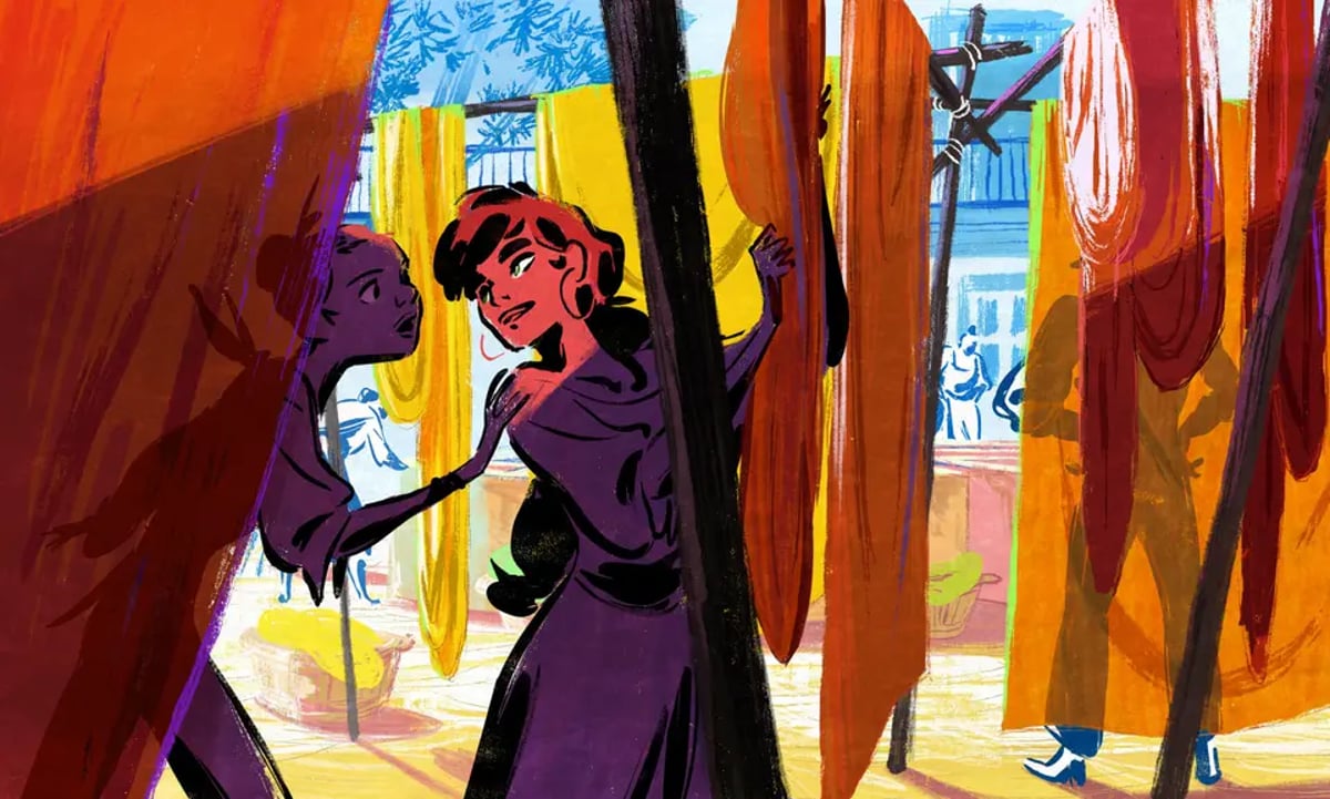
The film's aesthetic is imaginatively designed and iridescently hued. This isn't merely decorative; it's strategic. Downplaying the familiar music required a heightened visual vocabulary to maintain engagement and convey the story's emotional core. Laudenbach, whose previous feature Chicken for Linda! (co-directed with Chiara Malta) won the Cristal for best feature at Annecy 2023 and a César for Best Animated Feature, brings his distinctive minimalist, bold-brushstroke line work to Viva Carmen. Combined with a palette evocative of the high temperatures and high passions of 19th-century Andalusia, the film immerses the viewer in its environment without leaning on auditory cues. For readers tracking how this kind of design discipline crosses over into live-action craft, our Color Grading Mastery: From Technical Foundations to Creative Excellence guide unpacks the same principles in a different medium.
Consider the construction of a color palette designed to shift fluidly from day to night, from searing sun to blessed shade. This dynamic use of color is not simply artistic flair; it's a sophisticated method of spatial and emotional storytelling. Burnt hues of apricot, magenta, and aubergine evoke the specific heat and intensity of Seville, acting as a direct visual translation of the operatic passion the score would typically deliver. The film uses color in a painterly, almost chiaroscuro fashion (despite its animated medium) to sculpt the emotional landscape.
This approach aligns with principles often discussed in live-action cinematography, where light and shadow guide the audience's eye and shape perception of character and setting. In animation, these elements are built from the ground up, offering unparalleled control. The film's extravagantly painterly quality, thanks to Laudenbach's line work and Pedrosa's graphic design, turns every frame into a deliberate composition.
Reframing the Narrative: From Aria to Animation
The decision to make the story accessible to younger audiences, despite its source as a tale of murderous, hot-blooded amour fou, compels a fundamental re-evaluation of the narrative's thrust. When the traditional emotional anchors of the opera (its music) are largely omitted, the visual design steps forward to fulfill that role. The film's swooping, kinetic rhythm provides a visual tempo that replaces the musical rhythm inherent to an opera.
The screenplay by Santiago Otheguy and Sébastien Laudenbach, developed with producer Pierre-Henri Léon, diverges significantly from Bizet's opera and Prosper Mérimée's novella. Set in Seville in 1845, the film follows Salva, a teenage assistant to Antonio, a knife grinder who can see the future. After an encounter with the soldier José, Antonio issues a horrific prophecy, and Salva, along with a group of street kids led by Belén, sets out to change it and save Carmen. This child's-eye perspective requires that the visual language guide younger audiences through complex adult themes without the direct emotional shorthand of operatic music.
The reframing is overtly feminist in intent. Instead of a grim crime of passion, the film moves toward a call for solidarity among women and other disenfranchised groups, with Belén emerging as a community leader. As Laudenbach put it to Variety, he wanted Carmen as "a woman, not just an icon": her priority isn't love, it's freedom, and she is willing to pay the ultimate price for it. For the film to achieve emotional resonance, the visuals must construct that new trajectory with clarity and impact.
The Score as Visual Companion
While the source music is mostly excised, the film features an original score by Amine Bouhafa and Isabelle Laudenbach that interpolates scraps and strains of Bizet's compositions, stripped of operatic excess and given a folky lilt. Laudenbach has described the process as a game of recognition: familiar patterns from the opera surface inside an otherwise reinvented soundscape. Isabelle Laudenbach built the textures around traditional Spanish instruments and drums, Salva's flute (an instrument played in Andalucía), and an all-female flamenco band from Barcelona. The musical fragments become atmospheric elements that support the imagery instead of competing with it.
The casting follows the same logic. Camélia Jordana voices Carmen in the French-language version, with Spanish singer Silvia Pérez Cruz recording the role for the Spanish-language version under Laudenbach's supervision. When visuals are designed to be the primary emotional conduit, the score and vocal performances must act as atmospheric reinforcement, accentuating dramatic shifts established by color, movement, and character design.
Production Realities and Craft Insights
Viva Carmen is a Folivari production in association with Haut et Court Distribution and Global Constellation, with co-production from France 3 Cinéma, Auvergne-Rhône-Alpes Cinéma, and La Garde Montante, and represents a significant undertaking in independent animation. The runtime, standard for an animated feature, means every visually driven decision must be calibrated to sustain audience engagement without the traditional operatic scaffolding.
The film's path through Cannes Directors' Fortnight and Annecy positions it within a tradition of animated features that emphasize craft and innovation. The comparison to Chicken for Linda!'s international profile (it was distributed in the U.S. by GKIDS) underscores the potential for Viva Carmen to reach a broad audience that appreciates artful animation. For broader industry context on where this kind of work sits in the current market, see our analysis of VFX & Animation in 2026: Navigating Industry Volatility and Growth Prospects.
Working with a style as bold and painterly as Laudenbach's is a testament to the specialized skills required in animation. The process needs deep coordination between the director, graphic designer, animators, and post team to maintain visual continuity. The level of control over color intensity, kinetic rhythm, and line speaks to a highly refined pipeline (the same discipline live-action teams chase when they build a visual rulebook, as covered in our Cinematography Script Breakdown: From Emotional Spine to Visual Rulebook).
Viva Carmen is a compelling example of how visual storytelling, meticulously crafted through color, movement, and graphic design, can recontextualize a classic narrative. By muting the very musicality that defines Bizet's opera, Laudenbach champions the potency of animation as an art form capable of singing its own narrative. The film does not merely illustrate a story; it embodies it through a vibrant, kinetic visual language, asserting that sometimes the most profound emotions are best expressed not with a soaring aria, but with an intensely burnt hue of apricot.
---
© 2026 BlockReel DAO. All rights reserved. Licensed under CC BY-NC-ND 4.0 • No AI Training. Originally published on BlockReel DAO.