Vittorio Storaro Master Class: Color Systems & Lighting Craft
> This guide contains affiliate links. BlockReel may earn a small commission on qualifying purchases at no extra cost to you. All commissions go directly toward funding our DAO Film Festival and supporting independent filmmakers.
To see the work of Vittorio Storaro is to witness an argument. It is an argument made not in dialogue but in photons, a sustained thesis that light is not merely a tool for exposure but the primary emotional and philosophical material of cinema. His images are rarely just beautiful; they are dense with intention, coded with psychological meaning. One can feel this in the suffocating, mannered compositions of The Conformist (1970), where shafts of light from venetian blinds seem to slice through rooms and characters, visually enacting the era’s political and psychic fragmentation. The light itself feels ideological. This approach, treating color and luminance as narrative forces, became his indelible signature.
Whether capturing the amber-hued despair of a Parisian apartment in Last Tango in Paris (1972) or the hallucinatory, pyrotechnic greens and oranges of a war collapsing into madness in Apocalypse Now (1979), the principle remains. For Storaro, the cinematographer is not a technician executing a director’s vision but a co-author writing it. The Italian film journal Rai Cultura would later give this practice a name: “Autore della Cinematografia,” the author of the cinematography. It is a title that suggests his collaborations, most notably with Bernardo Bertolucci, Francis Ford Coppola, and Warren Beatty, “defined a new way of thinking the film image.” The result is a body of work that asks the filmmaker and the audience to look past the illuminated subject and consider the character of the illumination itself.
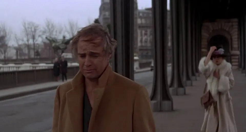
!Image Marlon Brando and Maria Schneider in Last Tango in Paris (1972)
The Arc
Vittorio Storaro’s career is a study in the fusion of classical European training with an almost metaphysical ambition. Born in Rome in 1940, he began his formal education not as a camera assistant on set but as a student, first of photography and then, at eighteen, at the prestigious Centro Sperimentale di Cinematografia. This was a foundational choice. An education at the Centro Sperimentale grounded him in the science of the medium, providing a deep, technical understanding of film stocks, processing, and optics that would become the bedrock for his expressive manipulations of color and contrast.
His professional career began in the late 1960s, with his first credited work as cinematographer on Giovinezza, giovinezza (1969). But it was The Spider’s Stratagem (1970) that initiated the collaboration that would define the first major phase of his arc: his partnership with director Bernardo Bertolucci.
That same year, their next film, The Conformist, served as an international announcement. Here the theory stopped being theory and started showing up on the negative. The film’s visual language was so fully formed, its use of color so psychologically precise, that it established Storaro as a major new voice. Watching the film, one can observe a rigorous chromatic logic at work. The world of Fascist Italy is rendered in cold, sterile blues and greys, dominated by an architectural severity that dwarfs the human figure. The light is often hard, linear, and oppressive. In contrast, the memories of a Parisian past are bathed in warm, autumnal tones of orange, gold, and amber, suggesting a life of sensual and intellectual possibility that the protagonist, Marcello Clerici, has chosen to betray.
How does a cinematographer visualize the consciousness of a man desperate to assimilate into a corrupt ideology? On this reading, Storaro’s answer is to make the light itself an extension of that psychic state. The film’s palette is not decorative; it is diagnostic. This use of color as a symbolic system, where different hues correspond to different emotional or philosophical states, would become a pillar of his craft, a method he would refine and expand for decades.
The collaboration with Bertolucci continued, deepening this exploration of interior states. In Last Tango in Paris, the amber light of the central apartment creates a hermetic world, a purgatorial space sealed off from the cold, indifferent blue light of the city outside. The color temperature itself defines the boundary between the couple’s raw, anonymous entanglement and the social reality they have fled. It is a visual strategy that renders the apartment less a physical location and more a shared psychological state, lit not by practicals but by obsession and grief.
Storaro’s arrival in American cinema was marked by two monumental productions that demanded a radical scaling of his principles. For Francis Ford Coppola’s Apocalypse Now, he won his first Academy Award. The project presented a new set of challenges: moving from the controlled interiority of his European work to the logistical chaos and grand scale of a war epic shot in the Philippine jungle. The journey upriver became a journey through a spectrum of light and shadow, a descent into a literal and figurative heart of darkness. The film’s visual texture runs on sensory overload, contrasting the lush, oppressive humidity of the jungle with the lurid, saturated colors of napalm, smoke, and flares. In the film’s final act, the lighting in Colonel Kurtz’s compound famously draws on the chiaroscuro of Caravaggio, sculpting Marlon Brando’s figure from an enveloping blackness. Light here is not about visibility but about what is withheld, creating a space of mythic dread.
With Warren Beatty’s Reds (1981), for which he won his second Oscar, the task was different again. The film is a historical epic, but it is framed by interviews with the real-life “witnesses” who knew John Reed and Louise Bryant. Storaro’s solution to integrating these documentary elements with the romantic sweep of the narrative is a masterstroke of structural cinematography. He shoots the contemporary witnesses against a featureless black void, keeping fill to a minimum so that faces emerge from an unlocated darkness carrying almost no environmental information. This stripped presentation separates them from the past, which is rendered in the rich, saturated color characteristic of his narrative work. The visual demarcation is absolute. It makes the past feel like a vibrant, contested memory, while the present is a stark reflection upon it.
His career continued through major collaborations with Carlos Saura and Woody Allen, and his work with Bertolucci reached its own epic conclusion with The Last Emperor (1987), earning him a third Academy Award. Across this immense body of work, the arc is clear. From the rigorous formalism of his Italian education to the grand canvases of international co-productions, Storaro’s trajectory has been one of unwavering commitment to an idea: that the cinematographer is a writer, and light is their language.
Signature Techniques
Vittorio Storaro’s body of work advances a clear, consistent argument: the cinematographer is not a technician but a co-author, an “Autore della Cinematografia.” His approach is rooted in a belief that light and color are not merely tools for exposure but primary elements of cinematic grammar, capable of articulating psychological states, philosophical conflicts, and narrative structure. This conviction, formed during his studies at Rome’s Centro Sperimentale di Cinematografia and honed in his long collaboration with Bernardo Bertolucci, produced a visual signature that is both intellectually rigorous and sensually overwhelming. His techniques are less a collection of tricks than a unified system for writing with light.
Color as Psychological Allegory
For Storaro, color is not an aesthetic flourish applied in post-production; it is a narrative system designed from pre-production. His international breakthrough on Bertolucci’s The Conformist (1970) remains the foundational text for this methodology. The film’s visual schema assigns specific chromatic values to psychological and political states. The world of Fascist Italy is rendered in sterile, monochromatic blues and oppressive whites, the colors of conformity and emotional death. We see this in the stark, rationalist architecture of the regime, where human figures are often subsumed by the cold geometry of their surroundings. In contrast, the memories of protagonist Marcello Clerici’s past, and his encounters with the vibrant, chaotic freedom he is tasked to destroy in Paris, are saturated with warmer, more complex autumnal tones.
This practice of creating a chromatic map for a film’s journey becomes a recurring principle. One can observe a similar, if distinct, logic at work in a film like Reds (1981). The film’s sprawling timeline, which follows the lives of John Reed and Louise Bryant through war, revolution, and personal turmoil, uses shifts in color temperature and saturation to delineate different eras and emotional states. The palette carries the audience through the story’s jumbled chronology, with the idealism of the early years feeling chromatically different from the disillusionment that follows. The color is not simply representing a historical period’s look. It is interpreting it. This approach elevates the cinematographer’s role from capturing a performance to providing a parallel, non-verbal commentary on it. The color tells its own story, sometimes in concert with the dialogue, sometimes in direct opposition to it. Building that map is a pre-production job shared across departments, which is why our guide to color palette planning between art, wardrobe, and the DP treats it as a scheduling problem before it is an aesthetic one.
None of this is intuition dressed up after the fact. Storaro built the system on Johann Wolfgang von Goethe's Theory of Colours (1810), which argued that colour is not only a physical property of light, as Newton had it, but a physiological and psychological event happening inside the viewer. Goethe held that individual colours provoke distinct bodily and emotional responses, and that opposites on the wheel carry opposed meanings. That gave Storaro something a physicist's spectrum could not: a vocabulary he could assign to characters and scenes before a single lamp went up. He set the whole framework down across his three-volume Writing with Light, whose second volume, Colours, works through the emotional value he attaches to each part of the spectrum, and he has taught it in masterclasses as a progression tied to the stages of a life, moving from red at the beginning toward violet at the end.
The practical consequence matters more than the philosophy. Because the meanings are fixed in advance, the palette can be scored like music: a character who belongs to one colour can be tracked, contradicted, or stripped of it across a film. When Marcello is finally allowed warmth in The Conformist, the warmth reads as a moral event rather than a lighting choice, because the film has spent an hour teaching us what cold means. You do not need to agree with Goethe to use the method. You need a rule set you apply consistently enough that the audience learns it without being told.
Light as a Philosophical Element
Storaro’s work is defined by a treatment of light that is fundamentally dialectical. Light does not exist to simply reveal; it exists in conflict and conversation with shadow. This dynamic is not about achieving a balanced exposure but about staging a philosophical battle. His work on Francis Ford Coppola’s Apocalypse Now (1979) is the clearest case of it. The film’s journey up the Nung River is a journey through a series of lighting schemes that chart Captain Willard’s descent into a moral abyss. The narrative progresses from the over-exposed, chaotic daylight of the war zone to the primal, impenetrable darkness of Colonel Kurtz’s compound.
What is the nature of the light in Kurtz’s domain? It is not the functional light of the military or the natural light of the jungle. It is ritualistic, elemental light. It is the hot, key light of fire, carving faces out of an oppressive blackness. It is the chiaroscuro of a Caravaggio painting, where enlightenment and madness are locked in the same frame. Storaro uses the physical properties of light (its hardness, its color temperature, its direction) to articulate the film’s central themes of civilization versus savagery, sanity versus insanity. The visual conflict between a single, hard source and the enveloping negative fill becomes a metaphor for the lone, corrupted soul against the void. This is what the Rai Cultura profile identifies as a method that “defined a new way of thinking the film image.” The light is not illuminating the theme. The light is the theme.
The Motivated, Operatic Camera
While Storaro is celebrated as a master of light, his camera movement is equally integral to his authorship. In collaboration with directors like Bertolucci, Coppola, and Warren Beatty, the camera is rarely a passive observer. It is an active participant, its movements motivated by character psychology, spatial inquiry, and rhythmic pacing. The long, fluid takes that characterize much of his work are not for spectacle alone; they are paragraphs of visual information, connecting characters to their environment and linking multiple dramatic beats into a single, flowing thought.
Consider the scale of films like 1900 (1976) or The Last Emperor (1987). The camera glides through vast landscapes, intricate palace corridors, and chaotic crowd scenes with a purpose that goes well past coverage. This operatic movement creates a sense of historical sweep, but it also functions on a micro level. A slow push-in on a character isn’t just a way to emphasize a line of dialogue; it’s a process of psychological penetration, mirroring the character’s dawning realization or encroaching dread. The camera’s movement has a weight and a grace that feels choreographed, closer to dance than to simple documentation. Reproducing that on a real schedule is a grip and operator problem as much as a design one, and it depends on the kind of movement choreography and rehearsal most low-budget days skip. This contrasts sharply with the static, proscenium-like framing of a director like Yasujirō Ozu or the frantic, handheld immediacy of the Dardenne brothers. For Storaro, the camera’s movement is a key part of the composition, a line of energy that guides the viewer’s eye and shapes the emotional rhythm of a scene.
Sculpting with Motivated and Unmotivated Light
A key to Storaro’s versatility is his mastery over both motivated and unmotivated light, and his understanding of when to deploy each. He can create a world of heightened naturalism or one of pure expressionism, often within the same film. Last Tango in Paris (1972) is a masterclass in the former. The film’s signature amber glow, which fills the central apartment, feels entirely motivated by the Parisian light filtering through large windows. It has the warmth and texture of a specific time and place. Yet that "natural" light is built shot by shot. It is the product of large, soft sources, carefully positioned and colored to create a consistent emotional temperature, a womb-like space that is both a refuge and a prison for its characters. The light feels real, but it is a reality heightened for emotional effect.
The Conformist runs the opposite argument: unmotivated, theatrical lighting taken as far as it goes. The famous scene in the fascist headquarters, with its vast, empty floor and stark shafts of light cutting through enormous venetian blinds, is a purely psychological space. The light source is not the sun; the source is the ideology of the regime itself, rendered as a cold, geometric, and dehumanizing force. This light does not seek to imitate reality. It seeks to interpret it, using hard-edged shadows and dramatic, single-source effects to create a visual correlative for a diseased political state. This dual capacity, to either ground a film in a tangible, tactile reality or to push it into pure visual metaphor, is central to his craft. He understands that the cinematographer’s most important choice is not what light to use, but what reality that light will serve. That decision sits upstream of any fixture list, which is the argument we make in Beyond Three-Point: What We're Really Chasing With Light and Lens.
Univisium and the 2:1 Frame
Storaro's authorship extends to the shape of the frame. In the 1990s he proposed Univisium, a single 2:1 aspect ratio meant to end the compromise between theatrical and television presentation. His reasoning was practical: a film composed for 2.39:1 gets cropped or letterboxed into uselessness on a home screen, while one composed for 1.85:1 gives away the width a cinema can hold. One ratio, protected from camera to delivery, keeps the composition the cinematographer actually made. He paired the proposal with 3-perf 35mm, which fits the taller-than-scope frame on less negative and cuts stock consumption by roughly a quarter.
The industry never adopted Univisium as a formal standard, and Storaro's own use of it (on Exorcist: The Beginning in 2004, then across the late Woody Allen films) stayed a minority position. Streaming arrived at nearly the same place on its own: 2:1 is now a routine delivery ratio for series and features because it survives phones, laptops, and projection without recomposition. The takeaway for anyone shooting a film that has to play a festival screen and a phone is the part worth stealing. Pick the ratio at prep, protect it in the camera and in the edit, and stop treating reframing as a post-production problem.
Case Study: The Conformist (1970)
!Image The Conformist (1970)
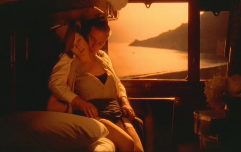
Bernardo Bertolucci’s The Conformist did not invent the use of color for psychological effect, but it so thoroughly integrated it into a film’s narrative and philosophical DNA that it became a new touchstone for the craft. For Vittorio Storaro, it was the film that announced his arrival as a true “Autore della Cinematografia,” an author of cinematography. His work here is not merely illustrative; it is interpretive. The film’s visual language, a dialectic of light and shadow, warmth and cold, becomes the primary text for understanding the protagonist, Marcello Clerici (Jean-Louis Trintignant), a man desperate to submerge his individuality within the monolithic structure of Italian Fascism.
One way to see the film's structure is as a conflict between two distinct lighting philosophies. The world of Fascist Rome is a domain of cold, rationalized, and oppressive light. Storaro and Bertolucci render it in stark blues, sterile whites, and deep, hard-edged shadows. Light streams through venetian blinds, slicing across rooms and characters, creating literal and metaphorical cages. The architecture of the Mussolini era, with its imposing scale and severe lines, becomes an active participant in the lighting scheme. Storaro doesn't fight the geometry; he weaponizes it. He uses wide lenses to emphasize the cavernous, empty spaces that dwarf the human figures within them, rendering them as cogs in an inhuman machine. That is not mood lighting. It’s a visual argument about the nature of a political ideology that prizes order above humanity, creating a world so controlled and airless that it feels like a beautiful tomb.
In direct opposition is the Paris of Professor Quadri, Marcello’s anti-fascist target. Here, the visual scheme shifts dramatically. The palette warms to autumnal golds, oranges, and deep reds. The light becomes softer, more diffuse, and seemingly motivated by natural sources (the sun through a hazy window, the warm glow of a lamp). Where the Roman scenes are defined by hard lines and static compositions, the Parisian sequences feel more fluid and alive. The camera moves with a greater sense of freedom, and the light wraps around the characters, particularly Quadri’s wife, Anna (Dominique Sanda), who embodies the sensuality and liberty Marcello both craves and fears. This contrast reaches its apex in the famous dance hall scene, a swirl of movement and warm, inviting practicals that represents everything missing from Marcello’s regimented existence. The color isn't just an aesthetic choice; it’s the film’s moral and emotional compass.
What, then, can a working filmmaker study in The Conformist? It is a masterclass in building a comprehensive visual system from a single thematic idea. Storaro’s work demonstrates that cinematography can be a form of critical inquiry. Every choice, from the specific hue of blue in a government office to the decision to let a lens flare wash out the frame as Marcello confronts his past, is tethered to the protagonist’s internal state. The film is a powerful reminder that light isn’t just for exposure. Light is meaning. By creating a rigid visual binary, Storaro gives the audience a direct, sensory experience of Marcello’s psychological prison and the vibrant world of freedom he is tasked to destroy. The film’s influence is immeasurable, directly inspiring Francis Ford Coppola (who hired Storaro for Apocalypse Now after seeing it), and providing a grammar for expressive color that filmmakers and cinematographers continue to draw upon decades later.
The film also stages its own thesis, literally, in Professor Quadri's Paris study. Marcello reminds his old teacher of a university lecture Quadri once gave on Plato's allegory of the cave, and the two men reconstruct it in the room: the shutters go closed, the study drops to near-darkness, and the men's shadows are thrown across the wall by the one slot of daylight still getting in. Storaro lights the whole exchange off that single hard source and the fall-off around it, which is the Caravaggio grammar applied to a philosophical argument rather than a mood.
The scene is the key to the entire visual design. Plato's prisoners take shadows on a wall for reality because they have never seen anything else. That is precisely the claim the film makes about fascism, and it is why the Rome sequences are built from blinds, grilles, and projected geometry rather than from faces. Marcello lives among shadows and calls them the world. Once you see the study scene, the venetian blinds stop being a stylistic tic and become the argument itself.
Case Study: Apocalypse Now (1979)
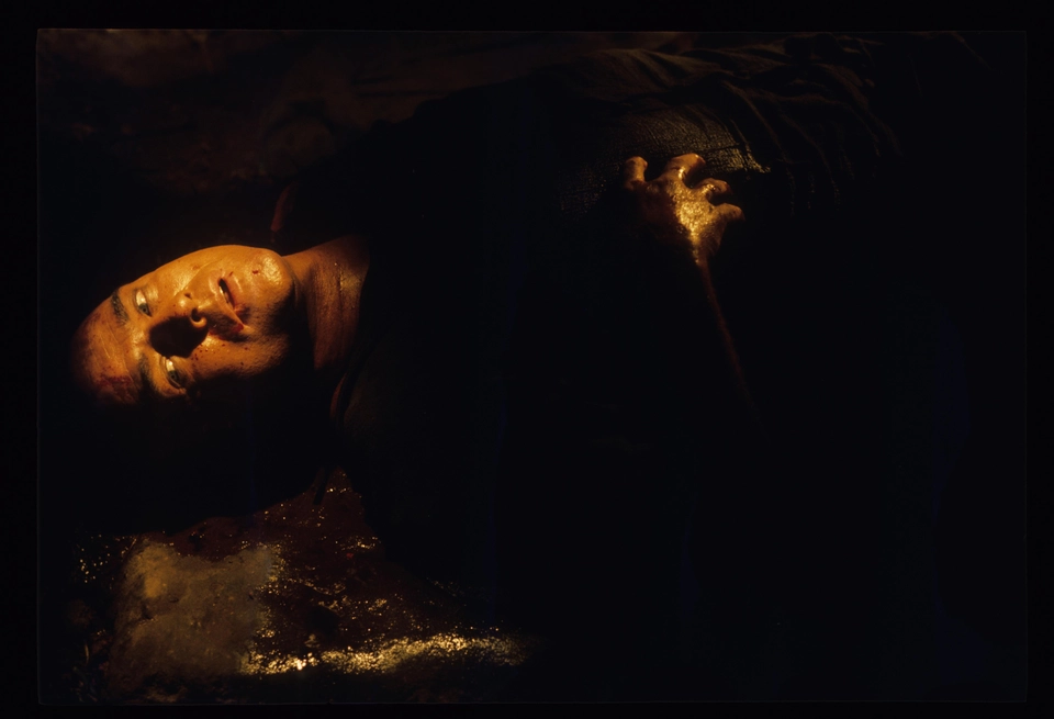
!Image Marlon Brando in Apocalypse Now (1979)
If The Conformist was an exercise in meticulous control, Apocalypse Now (1979) was its opposite: a descent into elemental chaos, both narratively and logistically. For Storaro, the challenge was no longer to impose a visual philosophy onto a controlled environment, but to discover one within the unpredictable heart of the Philippine jungle. The result is one of cinema’s great fever dreams, a film whose visual texture feels as hallucinatory and morally unmoored as Captain Willard’s journey up the Nung River. Storaro’s cinematography leaves psychology behind and goes mythic.
The film’s visual structure is a sustained collision between the natural and the artificial. On one hand, Storaro photographs the jungle itself as a living, breathing entity: humid, oppressive, and rendered in sickly greens and deep, impenetrable blacks. The light is often filtered through mist, rain, and smoke, creating a world without a clear horizon, a disorienting space that tracks Willard’s dissolving sanity. Against this natural canvas, Storaro throws the violent, theatrical light of war. The magnesium flares that burn with an otherworldly whiteness over the Do Lung Bridge, the lurid reds and purples of smoke grenades, the searchlights cutting across the water, the almost vaudevillian lighting for the Playboy bunny show, these are not attempts at realism. They are intrusions of a mad, technological world upon a primal one. Storaro pushes these colors toward an extreme of saturation through exposure, filtration, and colored smoke on the day rather than through correction afterward, creating a hyper-reality where the orange of a napalm strike feels both beautiful and terrifying, an aestheticized apocalypse. Working at that scale after dark is its own discipline, covered in our guide to night exteriors, exposure, and noise management.
This philosophy of light finds its ultimate expression in the film’s climactic encounter with Colonel Kurtz (Marlon Brando). Faced with an actor who was famously unprepared and physically dissimilar to the character as written, Coppola and Storaro turned a production problem into the film’s thematic center. How do you photograph a man who has receded from the world and become a myth? You photograph him as an idea, a voice emerging from darkness. Drawing on the chiaroscuro of painters like Caravaggio, Storaro lights Kurtz with single, often hard sources, sculpting his face out of absolute blackness.
He is rarely seen in full, objective light. Instead, he is a collection of fragments: a gleaming, shaven head; a hand gesturing from the shadows; a silhouette against a fiery backdrop. The darkness is not used to hide him, but to define him. It is the physical manifestation of his moral abyss, the “unsound mind” that has retreated into the jungle’s deepest recesses. Watching these scenes, one notices that the shadow is as important as the light. It has volume and presence. It is the space where Kurtz’s madness gestates, and from which his chilling pronouncements emanate.
For the filmmaker, Apocalypse Now is a study in embracing and aestheticizing chaos. It demonstrates a cinematographer’s ability to forge a coherent visual language not in spite of, but because of, logistical and environmental challenges. Storaro’s work here is elemental, concerned with fire, water, and darkness. He proves that a film’s look can be both viscerally spectacular and philosophically rigorous. By treating light and color as forces of nature and madness, he created a visual experience that doesn’t just depict a journey into the heart of darkness; it plunges the audience directly into it.
Collaborators
A cinematographer’s vision is realized through the director, and Vittorio Storaro’s career is defined by a handful of long partnerships. His work is not that of a hired technician executing a plan, but of a co-author shaping the film’s core visual and philosophical identity from its inception. These collaborations were not merely professional assignments; they were sustained dialogues on the nature of light, color, and narrative.
The most significant of these is with Bernardo Bertolucci. Beginning with The Spider’s Stratagem (1970), their partnership became one of modern cinema's most fruitful, yielding a body of work where the cinematography is inseparable from the directorial concept. That inseparability is not luck, it is the product of sustained director-DP alignment on theme before shot design. Bertolucci’s psychoanalytic and political preoccupations in The Conformist (1970) provided the ideal framework for Storaro to develop his theory of color, assigning specific chromatic values to the protagonist's fractured psyche and the moral chill of fascism. In Last Tango in Paris (1972), Bertolucci’s claustrophobic chamber drama allowed Storaro to turn a single apartment into a painterly canvas, using a consistent, almost monochromatic amber palette to signify a space outside of time and society. Their work culminated in the epic scale of 1900 (1976) and The Last Emperor (1987), where Storaro’s camera captured historical pageantry and, underneath it, the movement of ideology across decades.
With Francis Ford Coppola, Storaro took on one of the most punishing productions in film history, Apocalypse Now (1979). Coppola’s ambition was to create a film that was not about Vietnam but was Vietnam, an immersive, hallucinatory experience. This required a cinematographer capable of painting with light on a vast, unpredictable canvas, often in hostile conditions. Storaro answered with darkness and fire: deep shadows, colored smoke, and aggressive lens flares to plunge the audience into the same heart of darkness that Captain Willard navigates. The collaboration was a trial by fire, resulting in an Oscar for Storaro and a new benchmark for expressive, large-format cinematography.
Warren Beatty, as director and star of Reds (1981), enlisted Storaro for a project of a different scale and tone. Beatty’s sprawling biographical film about journalist John Reed required a visual language that could move cleanly between intimate, documentary-style interviews with historical “witnesses” and grand, romantic recreations of the Russian Revolution. Storaro’s achievement on Reds lies in this modulation. He created a soft, elegiac look for the witness interviews, lending their testimony a feeling of authentic memory, while capturing the epic political events with a painterly but grounded classicism, earning him his second Academy Award.
Later in his career, Storaro formed notable partnerships with directors like Carlos Saura and Woody Allen. For Saura, a director fascinated by the theatricality of dance, Storaro’s cinematography in films like Tango (1998) and Goya in Bordeaux (1999) explored the interplay of shadow, color, and the moving body, often blurring the line between stage and screen. With Woody Allen, on films such as Wonder Wheel (2017), Storaro introduced a saturated, almost hyper-real color palette that was a stark departure from the naturalism of Allen’s earlier work. Storaro’s lighting in Wonder Wheel externalizes the characters' theatrical jealousies and desires, transforming the 1950s Coney Island setting into a stage for a heightened, tragic drama.
Critical Reception and Counter-Readings
Vittorio Storaro is almost universally regarded as a master, an “Autore della Cinematografia” (Author of Cinematography), as the Italian broadcaster Rai Cultura framed it. The dominant critical reading positions him not as a photographer of action but as a philosopher of light. His work is praised for its operatic beauty, its psychological precision, and how far it moved the way filmmakers and audiences think about the image. Critics keep returning to the same point: the images are gorgeous and they are also dense with meaning. The consensus crystallized around The Conformist, a film that critics saw as the arrival of a fully formed, revolutionary talent. The film’s complex color scheme, contrasting the cold blues of the Fascist present with the nostalgic ambers of a remembered past, was immediately recognized as a landmark in narrative cinematography.
Yet, this very beauty has been the subject of significant critical debate and counter-reading. Where some see visual poetry, others see an aestheticism that risks overwhelming, and at times sanitizing, its subject matter. It is worth being precise about where that argument actually comes from, because it is often misattributed. Pauline Kael, reviewing The Conformist in The New Yorker in March 1971 under the title “The Poetry of Images”, was largely on the film’s side. She read Bertolucci as a director working in images rather than arguments, and she treated the picture’s sensuousness as the source of its power rather than a mask over emptiness. The style-over-substance charge came later and from elsewhere, and it belongs to a broader postwar argument about the seductiveness of fascist imagery that Susan Sontag set out in her 1975 essay “Fascinating Fascism.” The question that argument leaves on the table is the one every filmmaker working with ugly material eventually has to answer: at what point does a beautiful image of an ugly thing start to function as an endorsement of it?
This line of inquiry extends to other major works. A feminist reading of Last Tango in Paris, for instance, can be deeply troubled by the film's visual treatment of its central relationship. The film depicts a brutal and psychologically abusive sexual encounter, yet Storaro’s cinematography bathes the Parisian apartment in a warm, sensuous, and deeply romantic amber light. On this reading, the lighting aestheticizes a space of trauma. It creates a seductive visual cocoon that risks framing sexual violence as transgressive romance, aligning the viewer’s eye with a perspective that minimizes the brutality of the events depicted. The beauty of the image works to obscure the horror of the narrative.
These counter-readings do not negate Storaro’s technical mastery. Instead, they complicate it, forcing a more rigorous examination of the relationship between style and substance, between aesthetics and ethics. They challenge the simple equation of beauty with truth, suggesting that the most virtuosic images can sometimes serve to distract or even deceive. Is the overwhelming sensory experience of Apocalypse Now a critique of war’s insanity or a spectacular, thrilling rendition of it? Storaro’s work, precisely because of its power and beauty, exists on this knife’s edge, raising hard questions about what the image-maker owes the subject. It is instructive to set him against a cinematographer who answered the same questions by subtracting: Sven Nykvist's work for Bergman, examined in our Ingmar Bergman master study, reaches comparable emotional pressure with almost none of Storaro's chromatic apparatus.
What Working Filmmakers Should Steal
1. Lighting as a Dialectic Instead of simply lighting a scene for mood, build a philosophical argument with color and quality. Assign a specific chromatic identity to opposing forces in your narrative (e.g., freedom vs. control, past vs. present, sanity vs. madness). In The Conformist, the visual conflict between the cold, diffuse blue light of the fascist state and the warm, hard-edged light of memory isn't just an effect; it is the film's central thesis rendered in light. A character moving from a blue space to a warm one is making a journey between two poles of existence.
2. The Motivated but Exaggerated Source Find your motivation for a key light in a practical (a window, a desk lamp, a fire) but then give yourself permission to push its character far beyond realism for emotional effect. The light in the apartment of Last Tango in Paris is motivated by Paris's overcast sky and interior lamps, but Storaro and Bertolucci committed to an extreme color temperature, rendering everything in a deep, consistent amber. This choice transforms the light from mere illumination into a primary agent of the story, creating a self-contained world with its own physical and emotional laws.
3. Orchestrate Camera Movement to the Emotional Arc Treat the camera’s movement as a musical score that builds with the dramatic intensity of the scene. A simple push-in can become a devastating crescendo if its speed and duration are perfectly timed to a line of dialogue or a moment of realization. The grand, sweeping crane and dolly movements in The Last Emperor are not just establishing shots. The camera glides, soars, and circles through the Forbidden City with a fluid majesty that embodies both the emperor’s divine status and the suffocating elegance of his prison. The movement isn't observing the emotion; it is the emotion.
4. Use the Silhouette to Withhold and Imply Embrace underexposure as a narrative tool. By placing a character in silhouette against a brighter background, you withhold the specific emotion on their face, forcing the audience to project. This creates mystery, menace, or a sense of the universal. Colonel Kurtz in Apocalypse Now is introduced this way, his form emerging from an oppressive darkness. We hear his voice and feel his presence long before we are allowed to clearly see his face, a choice that builds him into a figure of mythic, terrifying power.
5. Treat Lens Flares as Part of the Story Rather than avoiding flares or removing them in post, use them deliberately. Anamorphic lens flares, when motivated by a powerful source within the frame, can represent a rupture in reality, a moment of sensory overload, or the intrusion of a violent or technological force. The constant, streaking flares from searchlights, explosions, and the sun in Apocalypse Now are not technical artifacts. They are a key part of the film's visual grammar, conveying the blinding chaos and disorientation of the war.
6. Carve with Negative Fill Use flags and other tools for negative fill not just to add contrast or modeling, but to actively subtract light and wrap your subjects in darkness. This is a powerful technique for suggesting interiority, isolation, or the weight of memory. In the interview segments of Reds, Storaro often places his "witnesses" against a dark background and uses negative fill to create deep shadows on the off-key side of their faces. This isolates them from their surroundings, focusing our attention entirely on their words and the subtle emotions that flicker across the illuminated portions of their faces.
7. Divide the Frame with Color Use distinct color temperatures within a single shot to delineate psychological or social boundaries. A character can literally stand with one foot in one world and one in another. In numerous scenes in The Conformist, Marcello Clerici (Jean-Louis Trintignant) is framed in doorways or hallways where the light shifts abruptly, for instance from the cold, sterile white of a modern building to the deep, enveloping shadow of a corridor. This visual schizophrenia mirrors his own divided self, caught between the safety of belonging and the desire he has spent a lifetime suppressing. The lesson generalizes past period drama: if a character is torn between two things, give those two things a color and let the character physically cross between them on camera. The audience reads the split before anyone explains it.
Further Study
Viewing order
Watch these in sequence rather than by reputation. The progression tracks how Storaro moved from photographing a story to arguing one.
1. The Spider's Stratagem (1970) - the first Bertolucci collaboration, and the clearest look at his pre-theory instincts. Watch how much he is already doing with practical sources and Emilian daylight.
One documentary belongs in this list: Hearts of Darkness: A Filmmaker's Apocalypse (1991), for the production footage of how the Apocalypse Now images were actually obtained.
Critical texts and scholarship
- Writing with Light: Volume 1, Images - Storaro's own three-volume statement of method. Volume 1 covers image, Volume 2 Colours, Volume 3 The Elements. Expensive, out of print in places, and the primary source for everything he has said about color symbolism.
If you want the same treatment applied to a cinematographer working now, our Roger Deakins master study covers the opposite temperament: restraint, motivation, and the refusal of the operatic.
Sources and Further Reading
---
© 2026 BlockReel DAO. Master Studies series. Licensed under CC BY-NC-ND 4.0.